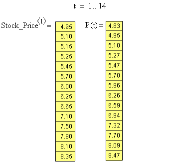
You may have noticed that the values generated by the formula are very close to the data values that were collected day-by-day:
Sometimes the equation's values are a little higher than the data values and sometimes they're a little lower. Overall, however, both the equation and the data seem to be following a similar trend.
This is even more apparent if we plot the data values together with a graph of the equation:
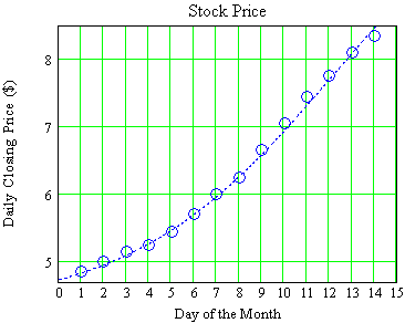
The blue circles show the daily data values; the dotted blue curve is a graph of values generated by the equation.
|
|
|
|
| Back to Contents | ||