Power Functions
Numeric Representation![]()
|
|
Recognizing a power trend in a data set might seem like difficult business, since power functions can look so much like exponentials or logarithms for long stretches of inputs. (See the section on modeling representations of power functions.)
However, a simple transformation of a data set will reveal a pattern that is unique to power functions, when it is present. Here is how it works.
Suppose a data set is actually following the trend of some hidden power function
If we take the logarithm of both sides of this equation (any logarithm will do) and use the laws of logarithms (see the section on algebraic representations of logarithms), we get
Now consider a new data set showing
This is linear. Linear data sets are easy to recognize.
The transformation of the data set from y vs. x to
For example, if we look at the data set for g above, together with its log-log transformation (we use
|
|
Notice that we could not have made this transformation if any of the data were negative, since we cannot take logarithms of negative numbers.
It isn't difficult to recognize the linear trend in the transformed data set, with a slope of approximately 0.5 and a y-intercept of 0 . (See the section on numerical representations of linear functions.) We have
This is just a square root function.
This method works equally well for data sets in which the inputs are not separated by equal intervals. In fact, nothing in this method depends on the relative spacing of the data.
For example, the data set for h above, together with its log-log transformation, is:
|
|
The transformed data set exhibits a linear trend with a slope of approximately 3.0 and a y-intercept of 0.6. We have
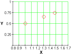
There are also graphical versions of the log-log data transformation.
The simplest is to plot

The straight line tells us that the original data set has a power trend.
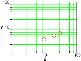
Alernatively, we can produce a log-log plot of the original, untransformed data set y vs. x and look for a straight line:

In this plot, the distances of the markings on the vertical scale above the x-axis, and the distances of the markings on the horizontal scale to the right of the y-axis, are the logarithms of the distances used on a standard plot. The effect of the plot is to show the trends in the transformed data set without actually having to compute all of the logarithms.
|
|
|
| Back to Contents | |